
MAGAZINE SPREAD REBOOT


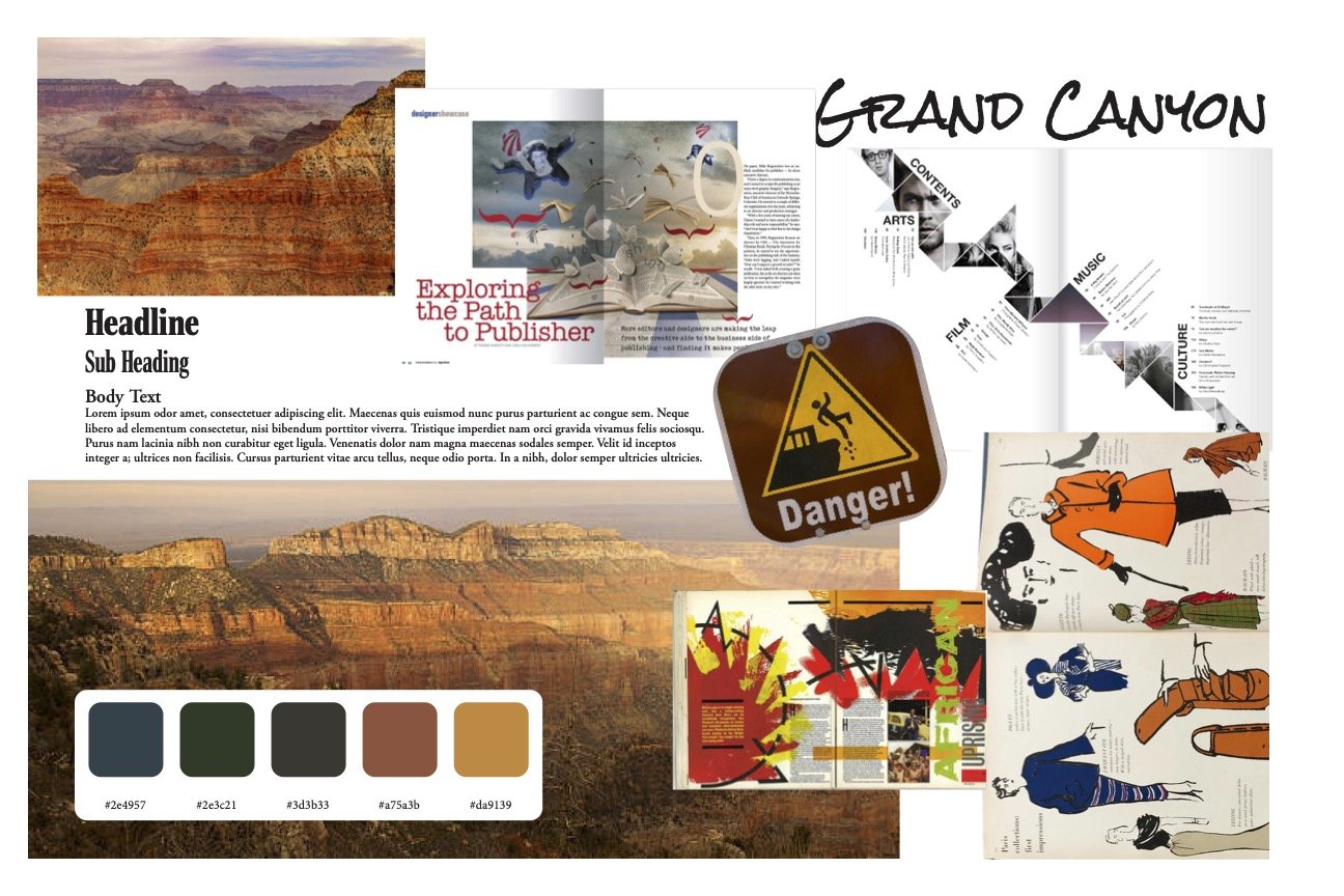
Moodboard
It all begins with an idea. Maybe you want to launch a business.
Process Work
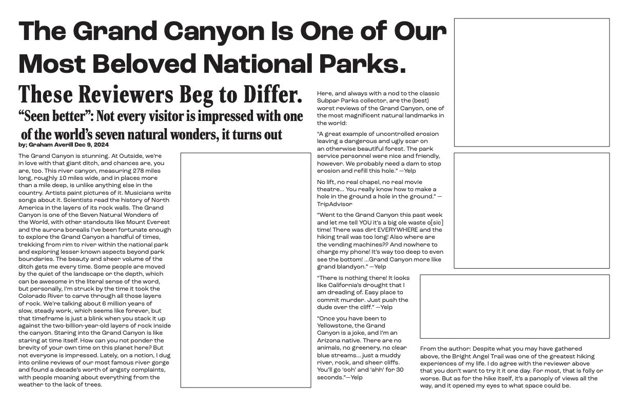
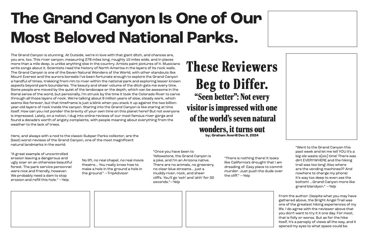
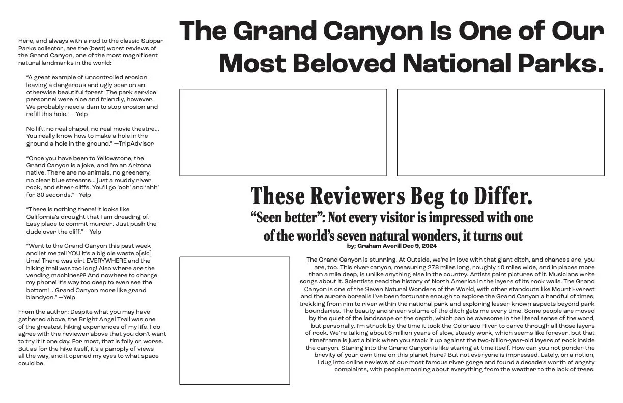
Beginning the design process I struggled with my grids and layout of text until I decided what type of imagery I wanted for the spread. With my article having five pull quotes I knew a layout with multiple images could get crowded and was trying to figure out an open layout. Looking through a lot of the same views I chose to single out the iconic erosion lines of the Grand Canyon to focus more on the structure of the text. This challenged me to push my hierarchy to create movement of the eye while still being readable. I found separating the three sentence long title allowed for better delivery of the information before reading the pull quotes. For the readers it wasn’t so obvious too, I placed the start of the title, the Grand Canyon in large text across the spread, contouring behind the edge of the wall leading the eye to title no. 2. Originally I didn’t enjoy the idea of a lot of text being on the image but with critiques I was able to find a layout I enjoyed. Title no. 2 gave enough context before the reader would jump to the pull quotes instead of title no. 3. Leaving out title no. 3 to be in the body font verses the same as the pull quotes and title no. 1 and no. 2 allowed me to drag the viewer's eye to the start of the article without distracting from the other hierarchy. Title no. 3 context was better suited to introduce the body text and give balance to the layout.
The assignment challenges the use of hierarchy while restricting the design with context and a set amount of text. Going simple in one direction doesn’t mean it’s going to be simple in all aspects. I chose to really challenge the hierarchy in my work. Taking the context of the article and organizing it in a way that doesn’t conform to the ideal order but to the intriguing information. The layout design of the article affects the way people read it, but brings them to reading more.