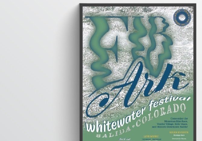
Typography Poster

Process work
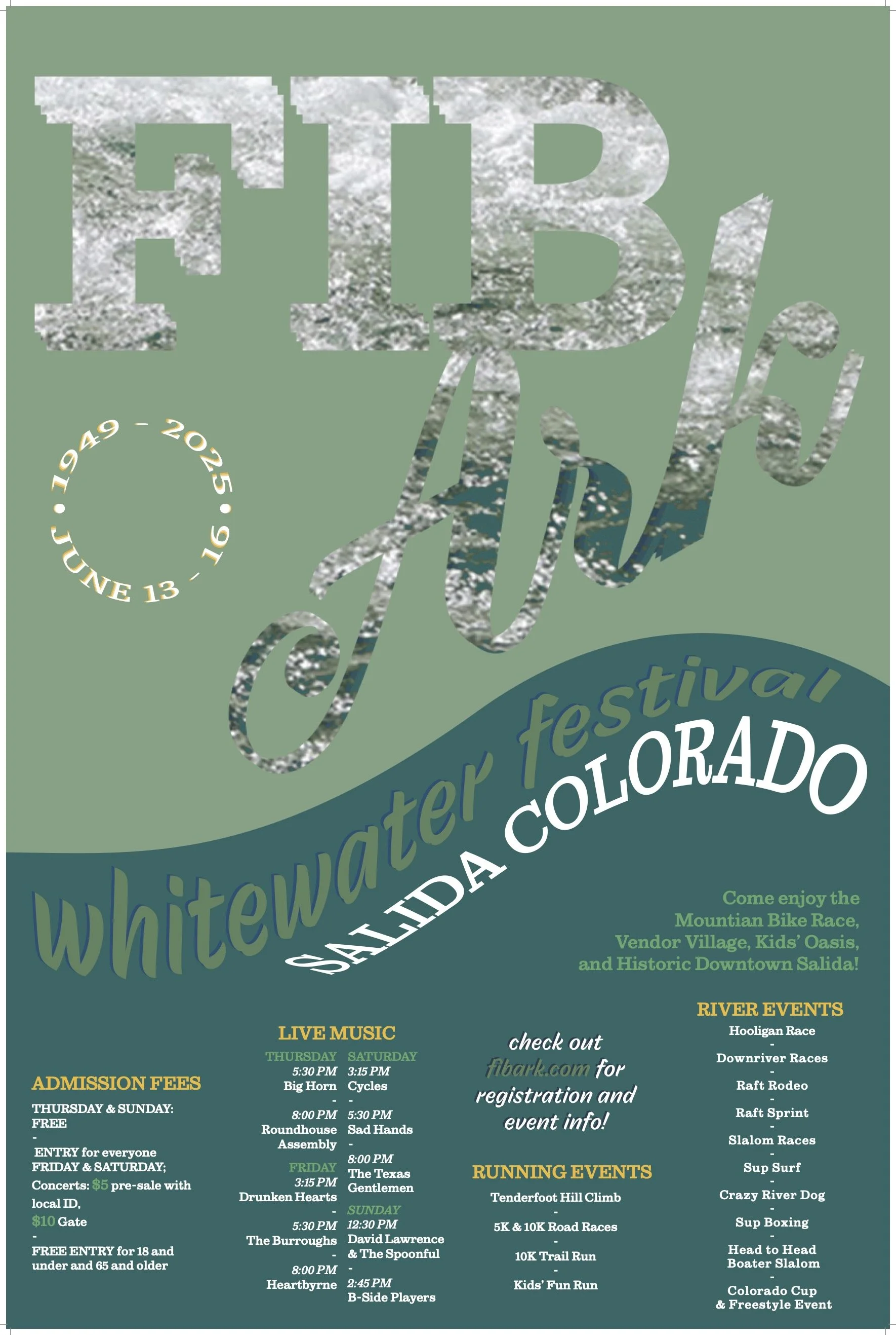
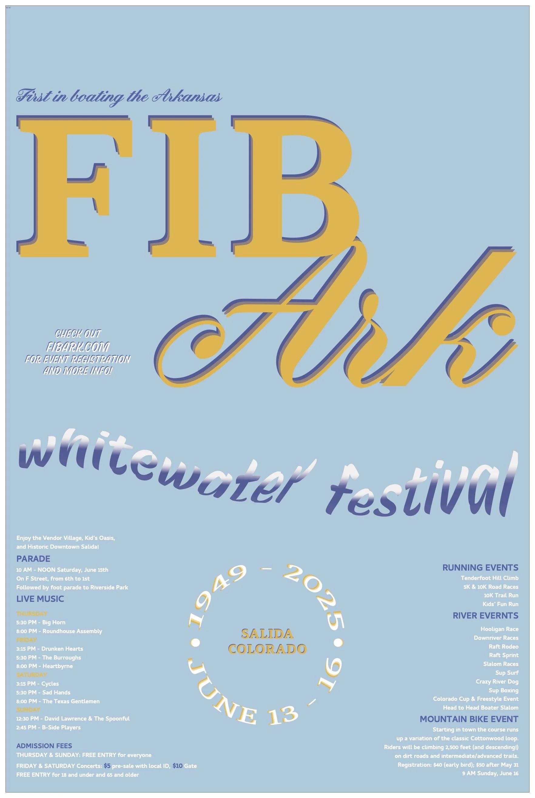

When designing my whitewater festival poster I really wanted to embody the movement of waves. I gave the title FIBArk whitewater texture that blended in with the color palette making it the main hierarchy while still directing the eye downwards towards the information. The ratio of leading text to informational text was successful. With movement of the eye leading left to right I aligned the Admissions Fees to the left and the Live Music text boxes to be aligned against each other to ground the text and follow the direction of the subtitles. I focused on proportions when distorting my text, making sure the text fit with each other to make the wave.
The purpose of this project was to push our designing skills when manipulating type. The areas where I struggled most were the color palette and giving the poster dimension. It is still a bit flat to me but the movement in the hierarchy helps make it feel more successful. The poster definitely has something missing in the design but no ideas that came to mind felt successful in my process. This project taught me a lot about using multiple adobe platforms together and the process of switching between them.